Push Tropical Colour Further
Beyond academic realism: how contemporary illustrators interpret the mango through high-chroma risograph inks, screen-print overprinting, and graphic silhouette work.
Breaking Free From Muted Naturalism
While 18th-century botanical prints prioritized pale watercolor washes on cream vellum, contemporary food illustration thrives on tactile saturation. The mango has emerged as a premier muse for modern printmakers because its natural palette sits at the extreme warm edge of visible pigmentation.
By translating the organic curves of the fruit into stylized vector silhouettes or linocut blocks, artists eliminate fussy surface noise. What remains is a pure emblem of tropical heat: the asymmetric wedge, the circular slice scored in a geometric checkerboard grid, and the energetic leaf curl.
“When you push the yellow into cadmium amber and hold it against a dense forest ground, the paper seems to emit its own internal warmth.”
— Atelier Screenprint Manifesto, 2026The Art of Risograph Overprinting
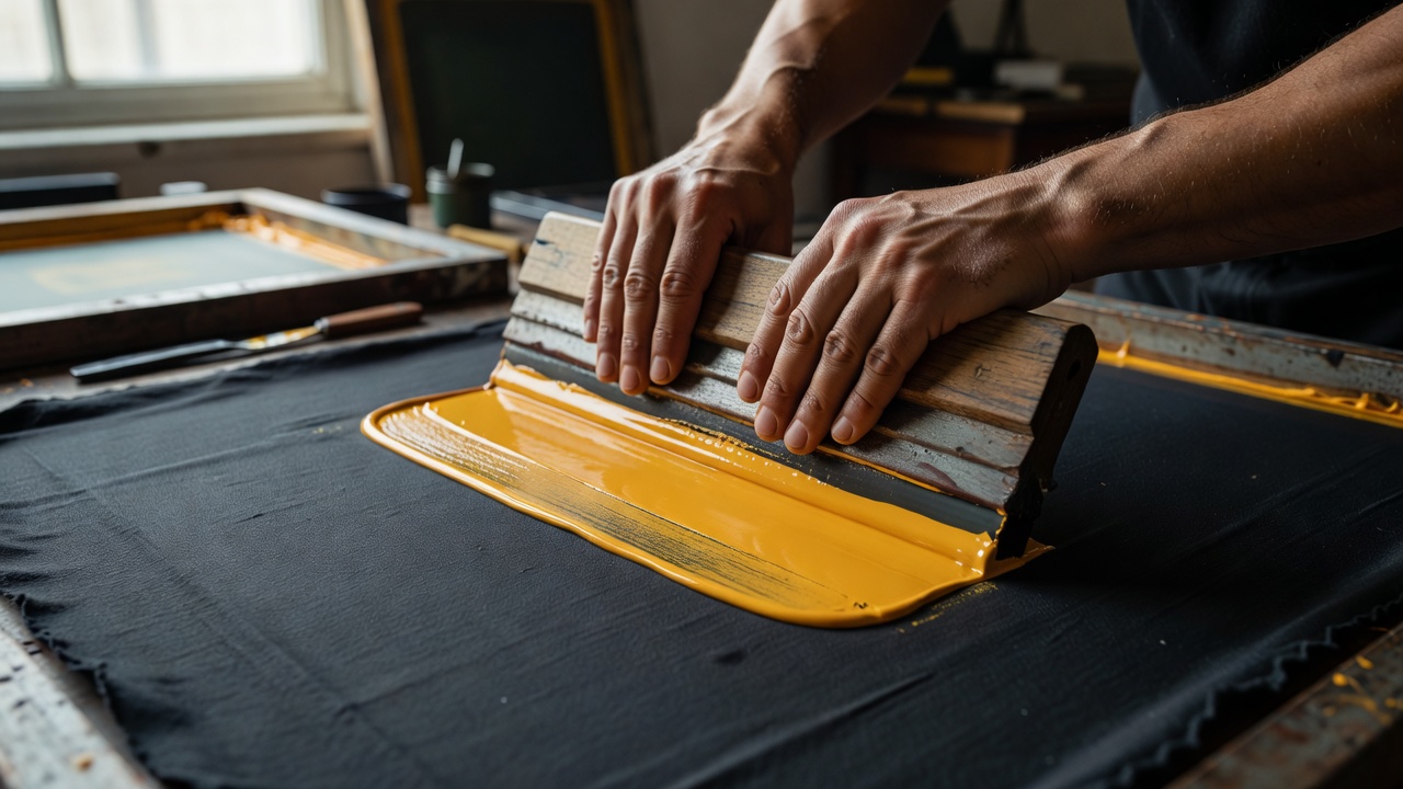
Risograph and relief printmakers utilize semi-translucent soy-based inks to produce new chromatic values directly on the paper. For mango-inspired prints, a four-pass separation creates remarkable depth without any cool blue pigments:
Four-Pass Studio Print Separation
Pass 1: Sunflower Gold Base (100% Solid)
Lays down the glowing core of the flesh, cheeks, and highlight zones.
Pass 2: Bright Red / Scarlet Halftone (30%–80%)
Overprinted onto the cheek and stem base. Where the scarlet blends with sunflower, a radiant tangerine hue is created optically on the fibers.
Pass 3: Deep Forest Green (50%–100%)
Defines the waxy leaves, stems, and raw fruit patches. When overlapping the sunflower pass, it shifts into rich olive-gold.
Pass 4: Metallic Brass / Raw Umber Accent
Used sparingly for text labels, contour accents, and framing rules to anchor the print into an editorial format.
Stylized Food Packaging & Monoprints
Today's graphic illustrators also draw inspiration from vintage fruit crate labels found in Ratnagiri, Manila, and Veracruz. These historic labels balanced bold hand-lettered sans-serif type with oversized, voluptuous illustrations of single champion fruits.
By honoring these traditions while applying contemporary editorial restraint—clean margins, refined typography, and purposeful negative space—mangozuvir.art artists produce works that feel equally suited to a gallery wall, a bespoke cookbook frontispiece, or a culinary atelier.